


Portfolio – Virginia Park
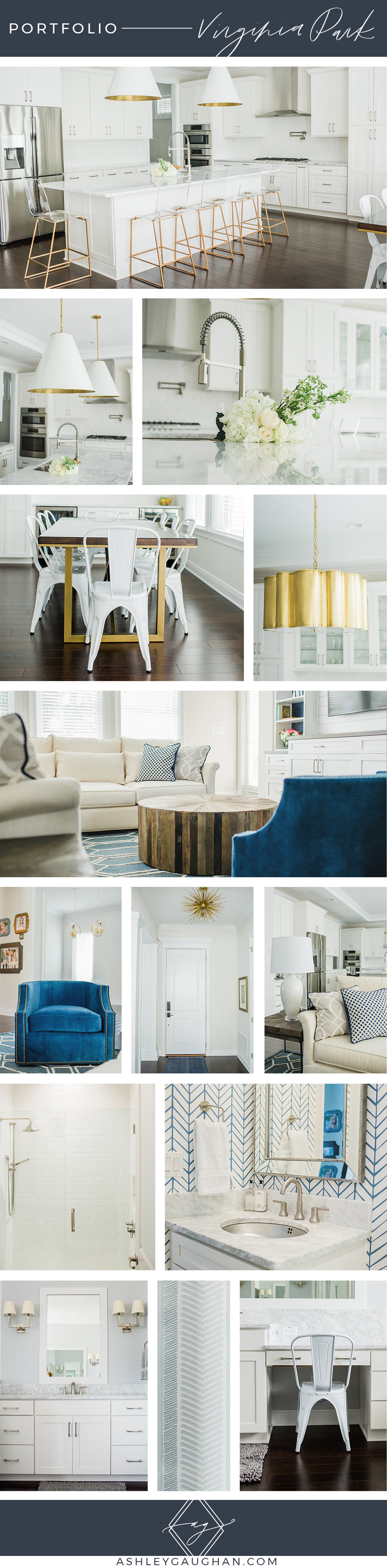
We love helping clients make their space personal with a fresh update. Luckily, this house already had some seriously gorgeous bones to work with. By creating a unifying color palette and thoughtful design it went from generic to something to go ga-ga over! We chose to highlight the bright whites, add pops of blue, stick with rich, dark woods, and incorporate the existing chrome and pair it with the addition of brass. Not only does mixing metals look beautiful, it’s a great way to insure that all your pieces will be complementary throughout the house.
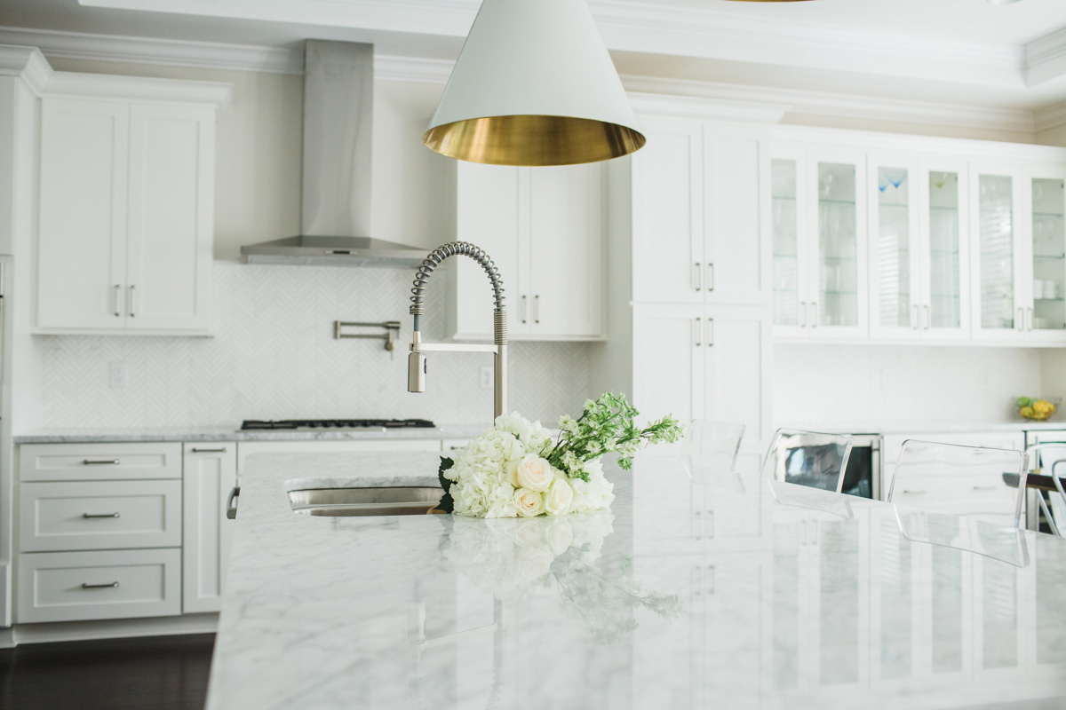
The beautiful natural light makes all the whites in this house shine. When using a neutral color throughout it is fun to incorporate different textures. White is repeated throughout the home in many different textures: smooth, shiny marble, subway tile backsplash, and bathroom tile, matte cabinets and walls, linen sofas, textured pillows, metal chairs, and glossy pendants.
The floors were a gorgeous deep dark brown. We chose several furniture pieces in the same hue to repeat this color throughout the house. The dining room table, coffee table, and end tables are all a rich brown that anchor the space.
Our client loves blue (and to be honest, who doesn’t?). So blue was repeated throughout the house generously. When playing with color, it is fun to use not only solids, but interesting, modern prints as well. This adds whimsy and character to your space. The bathroom wallpaper is one of our favorite parts of the house. Even the powder bathroom can get in on the fun! We also chose blue for the rugs, pillows, accents, and that chair. Don’t be afraid to play with texture when using color too. Just look at that velvet chair! Showstopper!
We always use at least two metal tones in a space. Chrome was an obvious choice because it was already in the kitchen, like the appliances, hood, faucet, and cabinet hardware. We wanted to add in brass because it just makes all things sparkly, like the marble and subway tile, even more radiant. Brass and chrome pick up the natural light of this house so well. You can see brass and silver throughout this house. Our favorite pops of brass are the unexpected underside of the kitchen pendants, the stool’s frame, dining table legs, and both insanely gorgeous chandeliers: quarterfoil in the dining room and sputnik in the foyer. Such fun shapes!
We highlighted what was already fantastic about the space, complemented it with a stunning color palette, and mixed up patterns, texture, and shape. Now it’s a stunning, modern, inviting space ready for entertaining or just living life.
We would love to help you create your own space like this that you love! Enjoy your week!
September 21, 2018

